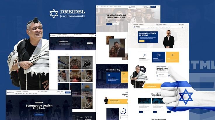
Creating a website for a Jewish organization involves more than just applying modern web design principles; it requires a thoughtful integration of cultural traditions and practical functionality. While the goal is to respect and reflect Jewish heritage, common mistakes can undermine the effectiveness of the site. This blog post highlights common mistakes in Jewish web design and offers practical solutions to avoid them, ensuring your website effectively balances tradition with modern usability.

Mistake 1: Overloading with Religious Imagery
Problem
Excessive Use of Symbols: Overusing traditional Jewish symbols, such as menorahs, Stars of David, or Torah scrolls, can make the site visually overwhelming and detract from the user experience.
Cluttered Design: A cluttered design can confuse users and make navigation difficult, leading to frustration and a higher bounce rate.
Solution
Balanced Integration: Use religious imagery sparingly and strategically. Incorporate symbols as accents rather than dominant elements. Aim for a clean and balanced design that respects cultural heritage without overwhelming the user.
Minimalism Approach: Adopt a minimalist design approach that uses white space effectively to highlight key elements and create a visually appealing layout. This helps maintain focus and improves readability.
Mistake 2: Neglecting Mobile Optimization
Problem
Non-Responsive Design: A website that is not optimized for mobile devices can result in poor user experience for visitors accessing the site from smartphones or tablets.
Difficult Navigation: Non-responsive sites often have navigation issues on smaller screens, making it challenging for users to interact with the content.
Solution
Responsive Design: Ensure that your website uses responsive design techniques to adapt seamlessly to various screen sizes. This includes flexible grids, images, and media queries that adjust layout elements based on the device.
Mobile-Friendly Features: Test your site on multiple devices to ensure that navigation, buttons, and forms are easy to use on mobile screens. Implement touch-friendly elements and ensure that interactive features work smoothly on all devices.
Mistake 3: Complex Navigation
Problem
Overcomplicated Menus: Complex or confusing navigation menus can make it difficult for users to find information quickly, leading to frustration and disengagement.
Hidden Information: Important content buried in deep submenus or not easily accessible can lead to users missing out on key information.
Solution
Simplified Navigation: Design intuitive and straightforward navigation menus with clear labels and logical organization. Group related content into well-defined categories and ensure that users can easily access key sections.
Search Functionality: Implement a robust search feature that allows users to quickly find specific information. Include filters and autocomplete options to enhance search efficiency.
Mistake 4: Ignoring Accessibility
Problem
Lack of Accessibility Features: A website that does not account for accessibility can exclude users with disabilities, such as those relying on screen readers or keyboard navigation.
Poor Contrast and Readability: Inadequate color contrast and small text sizes can make it difficult for users with visual impairments to read content.
Solution
Accessibility Standards: Follow web accessibility standards, such as the Web Content Accessibility Guidelines (WCAG), to ensure that your site is inclusive. Implement features like alternative text for images, keyboard navigation, and readable fonts.
High Contrast and Readable Fonts: Use high-contrast color combinations and readable fonts to enhance text visibility. Ensure that all content is accessible to users with varying visual capabilities.
Mistake 5: Inconsistent Branding
Problem
Brand Misalignment: Inconsistent branding, such as mismatched colors, fonts, or imagery, can create a disjointed user experience and undermine the site’s credibility.
Lack of Cultural Cohesion: Failing to align design elements with Jewish cultural values can result in a website that feels disconnected from its intended audience.
Solution
Consistent Branding: Maintain consistent branding throughout the website, including colors, fonts, and imagery. Align design elements with your organization’s identity and mission to create a cohesive and professional appearance.
Cultural Sensitivity: Ensure that all design elements respect and reflect Jewish cultural values. Engage with community members or cultural experts to review and provide feedback on design choices.
Mistake 6: Overlooking Content Strategy
Problem
Inadequate Content: Providing insufficient or outdated content can lead to a lack of engagement and interest from visitors.
Unstructured Information: Disorganized or poorly structured content can make it difficult for users to find relevant information and diminish the overall user experience.
Solution
Content Planning: Develop a comprehensive content strategy that includes regular updates and relevant information. Create a content calendar to ensure that new content is added consistently and remains current.
Structured Layout: Organize content into well-defined sections with clear headings and subheadings. Use visuals, such as images and videos, to complement text and enhance the content’s effectiveness.
Mistake 7: Failing to Include Effective Call-to-Actions
Problem
Weak Calls-to-Action: Ineffective or vague calls-to-action (CTAs) can result in missed opportunities for engagement, such as donations, event registrations, or newsletter sign-ups.
Unclear Messaging: CTAs that lack clarity or do not convey a sense of urgency can fail to prompt users to take action.
Solution
Clear CTAs: Design clear, compelling CTAs with specific action verbs, such as “Donate Now,” “Join Us,” or “Learn More.” Ensure that CTAs are prominently placed and visually distinct.
Urgency and Benefits: Highlight the benefits of taking action and create a sense of urgency when appropriate. Use persuasive language and design elements to encourage users to engage with the CTA.
Conclusion
Avoiding common mistakes in Jewish web design involves a careful balance of tradition and technology. By addressing issues such as overloading with imagery, neglecting mobile optimization, and failing to include effective CTAs, you can create a website that effectively engages users while respecting cultural values. Implementing these solutions will enhance usability, accessibility, and overall user experience, helping your website fulfill its purpose of connecting with and supporting the community.


